Logo design varies from person to person, brand to brand. This is the reason why there are about 8 different types of logo designs in the logo designing niche.
However, out of all these logo designs it is absolutely crucial for you, as the owner of your brand, to know which one is best suitable for your brand or startup.
Why is it important to know which logo suits your brand?
You might think to yourself that you are the person who wants to get the logo done and you may also know how you want it done and don't feel the need to go through the entire 'logo design process'.
Seriously, you have much better stuff to do, why go through this list when you know exactly what you want and how you want it?
Because, you might be wrong
And you being wrong can cause your audience to not understand what you are telling them, are you selling them a good or a service, are you a tech company or a fast food company, do you specialize in smartphones or laptops etc.
You might think that the process of designing a logo for your brand is as simple as making a good looking graphic, adding some eye-catching colors, and putting your brand name and tagline to finish it off.
Well, in reality it's not that simple and the devil is in the details. If it were that plain and straight forward every brand would have a logo that looks similar to another logo.
In order to stand out from the crowd and have a logo that is instantly recognizable it is important to know which one goes accordingly to your brand
For example, if you run a tech company that specializes in smartphones, your logo is supposed to communicate that through attractive visuals.
If you have no idea about the types of logos and how to determine which one will be appropriate to your brand you might wind up making the wrong decisions, costing you a loss in potential and repeat customers (as many people won't be able to remember your brand).
BTW this list isn't only for business owners but graphic designers as well so they have knowledge on what kind of logo would best suit their clients
The 8 Different Types of Logo Designs and Their Usage
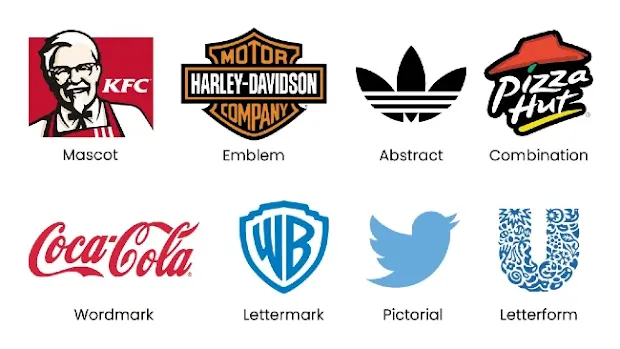
Now, let's dive down deeper into the logos and break them down one by one:
1. Wordmark Logo
A wordmark or logotype, is a logo that only consists of typography. It is a text-only logo that displays the company name.
Below are two very good examples of wordmark logos;

The above two logos are both wordmark logos but are very different from each other and unique in their own way.
What Makes a Wordmark Logo So Unique?
- Firstly, it depends solely on your company's name which means if the name of your company is unique so is your logo
- The wordmark logo is made purely from text meaning it includes all the elements of typography and typography has a handful of elements that can be played around with in order to make your logo stand out
- In a wordmark logo to achieve uniqueness the context of the brand is considered and typography is done accordingly
- Wordmark logos have the ability of incorporating psychological cues into text very clearly which can give a much more stronger sense of brand image. This could mean using a bold, 'heavy', slab-serif font to give your design a more strong and secure look or using a light, script font to give it a more 'soft' look
When to Use a Wordmark Logo?
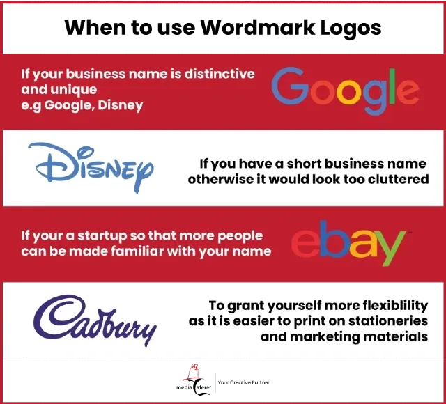
You should opt for a wordmark logo if:
- Your business name is distinct and unique. This is because since wordmark logos only use text and incorporate the name of the company it will look very plain and simple if the company name is not unique
- The name of your brand is not too long. If your brand name is very long it might not appeal to the audience as it would be harder to remember and would look too cluttered
- You're a startup and are trying to 'put your name out there'. When you first open up your brand it would be far difficult for your audience to remember you as you have not yet developed a strong brand identity. Thus, having a typographic logo will make people know who you are without putting in much effort
- You want more flexibility with your logo. A type logo is much more manageable than other logo types. You can easily print them on stationery and/or marketing materials without adding any extra cost
2. Mascot Logo
The mascot logo, in my opinion, is perhaps the strongest logo when it comes to being memorable.
Mascot logos have the power to be 'embedded' in people's mind as they are usually very distinct
It also adds personality and intrigue into the brand, haven't you ever wondered, "who's the red haired girl on the Wendy's logo?" or "who's the man on the KFC logo?"
It is no doubt that people remember mascots and that they stand out from the crowd however, it is a demanding task to manage a mascot logo as you're not only responsible of the logo but also the mascot meaning you're handling two things at once where one is depending on the other.
Let's look at another very famous mascot:
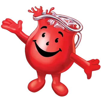
Being one of the cool kids at school you definitely ought to recognize this guy.
The Kool-aid mascot, 'Kool-Aid Man' was a large glass pitcher filled with red-colored kool-aid and had a catchphrase saying, "Oh Yeah!" while breaking through a wall. He has no doubt made a great name for himself and acts as a great example for up and coming mascots.
Mascot logos also set the grounds for marketing, meaning, since they are the face of your brand, you may include them in commercials, live events and even social media.
Here's how Kool-aid achieved this:

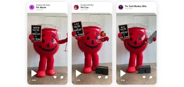
Kool-aid man actually made such a great name for himself that he even got his footprints established and displayed in the Hastings museum, Nebraska.
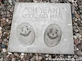
If you are going for a mascot logo you have to know what you're getting yourself into as being the face of your brand it would be a daunting task to rebrand or maintain you're character throughout the years.
For example, when's the last time you saw Ronald McDonald? The friendly (I thought he was creepy but since majority people said he was friendly we'll go with that) and warm welcoming clown. Probably a very long time ago right? This is what McDonald's had to say;
We're afraid that Ronald McDonald's no longer appears in McDonald's U.K. advertising, he is still very busy working for us. He often travels up and down the country to help promote some of our exciting new activities and visits our restaurants to make sure everyone is enjoying their meals.
Yeah, so he probably ain't coming back
When to Use a Mascot Logo?
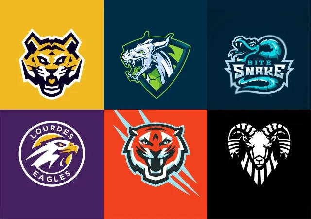
- Mascot logos are usually used when the target audience is kids, family or energetic crowds. You'll see mascot logos being used the most on gaming events like eSports:
- If you require a logo that is a one size fits it all, then you shouldn't go for a mascot logo. The reason for this is that if you want to print your logo on stationery materials resizing the logo can actually cause a loss in quality and details since the logo usually does have a lot of small detailing on it
- Having a mascot depends on the type of vibe you are going for if you are trying to go for a more formal and professional brand image using a mascot might not be the best option. It is great for brands that are meant to be fun and energetic
- If you have no plans to rebrand only then you should consider a mascot logo as it requires a lot of commitment to stick with it because once your mascot is put into the world for viewers to see and hear it's there to stay and removing or changing it can leave fans disappointed
3. Emblem Logo
Emblem logos include a symbol or icon usually combined with a font with seals, crests and badges
Emblem logos make up a very traditional brand image however, many businesses nowadays have managed to update their logos to have a more modern appeal to them
When to Use an Emblem logo?
- If you want your brand to have a traditional look it might be wise to go for an emblem logo
- You'll see emblem logos being most used in schools, universities, foot ball clubs if you want your audience to recognize you as part of this industry it might be better to go for an emblem logo
4. Abstract Logo
An Abstract logo is a unique kind of pictoral logo. In this, the image (graphic) is not very clear as it does not include a recognizable image or shape such as a burger or a mobile. It usually uses geometric shapes to form a symbol for your brand.
The Abstract logo usually relies on color and form to communicate it's message plus, it's a challenge to understand what the logo might actually mean.
If done right it can become a great symbol for the audience to remember and you will stand out from the crowd.
But, if not implemented the right way it can cause your viewers to simply not 'get it' which will leave your logo wasted. People would much rather prefer to call you by name than to remember what your logo was like, which is why I suggested you to go with a wordmark logo if you are a startup.
When to use an Abstract logo?
There's no right or wrong way to use an abstract logo. It can be used for any brand that is aiming to make it's logo unique however if you aren't a graphic designer, it's best to leave this kind of logo to a professional as one wrong move can ruin the image you're going for.
5. Pictorial Logo

A pictorial mark, sometimes referred to as a symbol or brand mark, is an icon or graphic logo.
The pictorial logos that might come in your mind at first are well established, iconic logos such as, Apple, Twitter, Instagram etc.
However, these all share one thing in common and that is a very strong brand identity. If, let's say, Apple wasn't a worldwide famous brand, would you actually think that an apple would be the sign of a highly innovative tech giant?
However, it's not always mandatory for you to have a top notch brand identity in order to make a pictorial logo work.
Sometimes brands rely on the image to be self-explanatory;
For example the panda on the wwf logo above does it's job right. Even if you didn't know what the brand itself was about you could have an idea.
The panda is an endangered species so it had to be something relevant to that. Pandas are found in nature so it's probably a brand that works on helping endangered species and better maintaining the natural environment.
And you would be pretty close to the actual brand message which is to fund projects that work on protecting endangered species and better maintain the ecology, nature and environment of the world.
Whereas, when you look at apple and twitter one looks like the logo of an organic supermarket and the other looks like a bird whistling app (ok maybe that's a stretch, but you get the point.)
When to use a Pictorial logo?
- If you have a strong brand recognition you should definitely go for a pictoral logo as people would better link your brand image to your logo
- If you have a simple and straightforward brand message that can be conveyed in a single image go for it as you don't have much options to explain yourself with a pictoral logo. A good example is Pinterest:

- Personally, I've seen brand marks working nicely for brands that have a 'deeper' meaning into the brand which is known to invoke some emotion.
6. Combination Mark
Thanks to it's versatility and legibility, the combination mark is one of the most famous and common type of logo that most brands prefer.
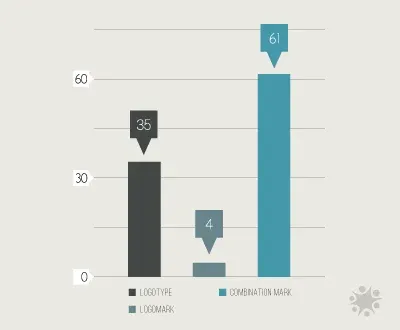
A study done by Design Crowd also showed that 61 out of 100 brands preferred using a pictorial logo for their company than other logo types:
A combination mark combines the name of your business with an image/graphic.
This makes it easier for your target customers to identify you in the ocean of brands and associate your logo with your name.
It also gives your customers more options to remember you by name or logo.
Plus, it's very flexible you can place your image and name side by side, on top of one another or cleverly merge them as burger king had done.
When to use a Combination logo?
A combination logo can be used for any kind of business. I've seen it being used for schools, restaurants, bakeries, tech companies etc.
The reason for this is that a combination mark is very unique as the company or graphic designer has a lot of options to alter the logo.
So, basically if you're not going for one specific look or are trying to play it safe, combination mark is the way to go.
7. Lettermark
A lettermark logo is a very simple text-only logo that usually consists of the brand's initials.
HBO is a famous example where the letters actually stand for home box office just like "hp" stands for Hewlett Packard, the creator of hp laptops.
It's also much more easier and convenient for people to just say the initials of a business rather than the whole name e.g it's much more convenient to say 'NASA' than National Aeronautics and Space Administration.
A lettermark is unique as no company name is the same as the other which means the brand initials might also be distinctive.
The good thing about a lettermark is that you can condense your business name into a logo despite how long your company name is.
When to use a Lettermark?
- If your company has a long and hard to remember name it would be a good choice to go for a lettermark as it will condense your long name into initials which will be more suitable for your audience
- If you're brand craves simplicity then the lettermark is as simple as you can get
- Just like a wordmark a lettermark also consists of only typography meaning it has a handful of elements to play around with to make a great logo
- Finally, I have seen a lot of people using lettermarks for their real life names e.g. Warner Bros. was founded by brothers Jack, Harry, Albert and Sam Warner thus the name Warner (their last name) and bros, which is short for brothers, became their lettermark
8. Letterform
A letterform is a logo that usually only includes the first letter of the brand into it's design.
Often, brands use a letterform along with a wordmark logo e.g. Google, Netflix, Pinterest
Letterforms are most commonly used as favicons, app icons and stationery/marketing material.
Now, most graphic designers may argue that the lettermark and letterform are the same thing however, I personally think there is a difference between lettermarks and letterforms
Lettermark VS Letterform
- A lettermark is a logo that is designed keeping in mind the brand initials whereas, for a letterform only the first letter of the brand is considered
- A letterform is usually made for brands that have a small name but, lettermarks are ideal for brand names that have a long name so that they can be condensed into it's initials
- A letterform requires a lot of creativity to pay off as it's not as distinguishable compared to a lettermark e.g. let's say you have a company called 'Farm Fresh Organic Foodies' now if you were to make a lettermark for that it'll be written as 'FFOF' which makes it stand out as they're isn't a brand I can think of that has the exact initials but, if we were to make it a letterform it would only include the starting 'F' and that might clash with other brands with the same idea such as, Facebook and flipkart.

When to use a letterform?
- If you have a short brand name it might be wise to have a letterform logo as people will find it easier to remember you
- A letterform requires a lot of creative elements to stand out from the crowd if you can make the logo exciting without it losing it's brand image using a letterform might give you an edge
- For a letterform to be effective a person must have to see it repetitively so he could associate it with your brand. If you plan on running marketing campaigns you can pop your logo in there making people more familiar with your logo and how it's attached to your brand.
Conclusion
To sum up we discussed 8 different types of logos you can use for your brand namely, Wordmark, Mascot, Emblem, Abstract, Pictorial, Combination, Lettermark and Letterform.
There are some things to consider before deciding the right logo for your brand so hopefully, this article might have made it clearer to you on what type of logo is best suitable for you.
As a freelance logo designer, it's also important to know the types of logo to help price your logo designs, so you land more clients and make more money on your projects.


