Knowing about Color theory can be helpful for all kinds of creatives whether they are graphic designers, artists, fashion designers or interior designers. Color theory lays down a foundation of general guidelines and principles to follow that can help in choosing the right colors for your work.
If you are a beginner designer, you know how hard it can be to figure out which colors to use. You might wonder which colors could go well together or why some colors might look better than others.
Understanding colors through color theory can help answer those questions. In this article, I’ll try to go through the basic definitions, history, importance, and practical uses of color theory for better designs. This would be helpful for most of you out there trying to learn more about colors in general.
What is Color Theory?
Color Theory is a set of fundamental rules and guidelines for colors, color combinations and color schemes that are used in design and art for visual appeal or communication. Color theory is also used to achieve color harmony which happens when a combination of colors are put together in a way that is pleasing to the viewers.
Designers and artists are picky with their color selections and for good reason. Choosing the wrong colors can ruin a great piece of design by either making it unappealing or wrongly communicate its message. Color theory is used to avoid that by helping designers pick the right colors for their brand, message, or visual.
Although there are many definitions, uses, and insights you can find on color theory we will stick to these basic headings:
- History of color theory
- Importance
- Additive vs Subtractive Coloring
- The Color wheel
- Color harmony
- Colors in context
I’m confident that after learning the above you would know everything you need to get started with colors.
Brief History of Color Theory

Our world has been filled with bright vibrant colors since the start but Isaac Newton can be credited as the first one to develop a formal theory behind colors. He experimented with sunlight and a glass prism. By holding the glass prism in front of sunlight, he demonstrated that the sunlight split into 7 different colors (the colors we see on the rainbow). Newton was the first man to arrange these colors in a wheel showcasing the different colors of the spectrum.
“…if the sun’s light consisted of but one sort of rays, there would be but one color in the whole world…” – Sir Isaac Newton, Opticks
This led to the creation of the color wheel, which is still used till date to identify primary, secondary, and tertiary colors. We’ll learn more about the color wheel later in this article.
Importance of Understanding Color Theory
There must be a reason that color has been so extensively studied and researched by many of the top mathematicians, philosophers, and artists. The color wheel has brought us many possibilities of combining colors and achieving harmony within them. This is usually the main goal of a designer or artist as having a harmonious color scheme helps improve the aesthetic of a design or art piece.
Learning how to use and deal with colors can also be absolutely crucial in product design. Having a harmonious color scheme can not only beautify the user interface (UI) but can also greatly improve the user experience (UX). Take a look at these statistics:
- Users form an opinion about a product within 90 seconds. People base that assessment mostly on its color. (Source: University of Winnipeg)
- Colors alone are responsible for 60% of users’ acceptance or rejection of a product. (Source: University of Winnipeg)
- According to 90% of small business owners, colors help customers remember presentations and documents better. (source: Xerox)
Having contrasting colors can improve legibility and readability of your text and designs. If people cannot properly see your product, design, artwork, or text why would they want to continue looking at it?

A growing population of internet users have also opened doors to another benefit of color theory – accessibility.
Accessibility is the concept of making a product or service accessible to everyone – This especially includes people with disabilities. Visual impairments might be more common than you think, consider the following statistics from WebAIM:
- About 4% of the population have low vision, whereas 0.6% are blind.
- An estimated 8% of men and 0.5% of women are affected by color blindness.
With accessibility in mind, designers would not look at color theory as just a way of choosing colors but choosing the kind of colors that would be appealing to every viewer. Although this isn’t 100% achievable we can get pretty close using color theory. Color theory would help us in choosing good color combinations by avoiding bad color combinations such as, brown and green or blue and purple.
Having a better, well-thought out plan on how and where to use certain colors can greatly improve the UX. Not to mention you would also have a bigger reach as your designs would now be accessible to a larger number of people.
Additive vs Subtractive Coloring
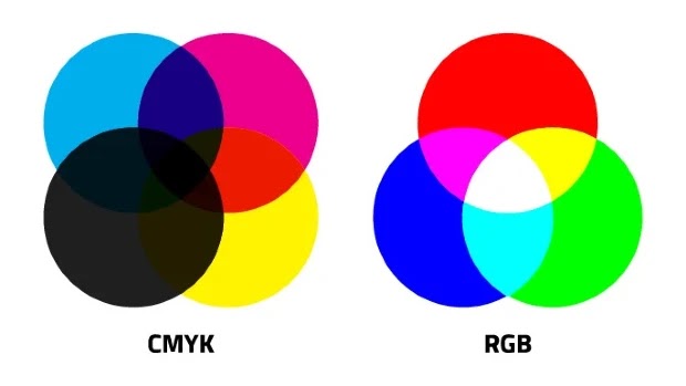
When we talk about color wheels we are essentially talking about traditional color theory however there are more modern types of color models – namely additive and subtractive coloring.
Additive Coloring
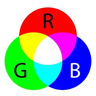
The additive coloring model refers to mixing red, green, and blue light together to give you different colors. As a designer, who may have worked on photo-editing or graphic design software you might be familiar with this as the RGB color mode.
It is called Additive coloring as you keep on “adding” various intensities of RGB light waves until you get your desired color.
Additive coloring is used for digital screens, TVs, and projectors. RGB colors are used for digital screens as these electronic devices are dark (black) which is why light is needed to display something on the screen. Millions of red, green, and blue colored dots come together to emit light through these devices including the one you’re using now.
When designing, it is important to know about the RGB color mode. If you are designing a logo for a website you should work with RGB otherwise it would display the wrong colors. If you design a logo in CMYK for Facebook or Instagram it will lose its vibrancy and would be dull in color.
Subtractive Coloring
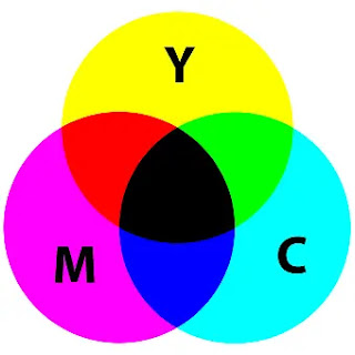
The subtractive coloring model is basically the opposite of additive coloring. In additive coloring we start with black and add light with different intensities to display colors – with white light being the brightest as it includes all the primary colors mixed with 100% intensity. In subtractive coloring we start with white and subtract the intensity of colors from it to display the colors we want.
It is called Subtractive coloring as you “subtract” various intensities of RGB light from the white paper. You do this until the paper reflects your desired color.
When it comes to graphic designing or digital designing this method is called the CMYK color mode. CMYK stands for Cyan, Magenta, Yellow, and Key (black). The CMYK color mode is used for printing – such as, designing brochures, magazines, flyers etc. Nowadays, the designs are made digitally in CMYK color mode so that they display as it is when printed.
The CMYK process is used for printing as the white is already provided by the paper. Cyan is a complement of red thus it absorbs it and reflects it in white light. Just like that, magenta is a complement of green and yellow is a complement of blue. The amount of CMY controls how much of the light would be reflected – leading to a wide range of color combinations with different saturations.
You can learn more about the CMYK and RGB models by checking out my post on RGB and CMYK Color Modes in Graphic Design.
What is Key in CMYK?
In print production, key is black and is the result of mixing together the 3 colors cyan, magenta, and yellow. It is called key as it is the key color that determines all other colors. This black ink is used when printing to reduce or cover unwanted tints and imperfections. It is also used to improve the sharpness of the image.
You should use CMYK when designing for print so the colors appear as they should. If you use RGB for designing print material you’ll get colors that might be of too rich or high in contrast. This would also increase printing costs as you would have to re-print the design in CMYK.
Color Wheel
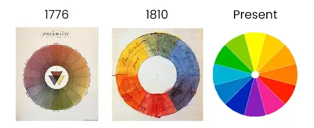
The color wheel was the first major breakthrough in traditional color theory. The color wheel is a circular representation of different hues. These hues are arranged in a logical sequence by showing the relationship between each color. The color wheel is derived from the three primary colors – red, yellow, and blue.
The first color wheel was presented by Sir. Isaac Newton in 1666 and was further researched and developed. There were many debates around the color wheel proposed by Newton which led to newer concepts.

Moving on from history to the modern world, the color wheel can be used to identify the relationship between primary, secondary, and tertiary colors. By knowing which colors go together and don’t go together you can create various color schemes for your design.
The color wheel starts with primary colors red, yellow, and blue. The primary colors are mixed together to create secondary colors green, purple, and orange – that are complementary to the primary colors. Finally, by mixing the primary and secondary colors together we get tertiary colors such as, blue-green, blue-violet, red-orange, red-violet, yellow-orange, and yellow-green. We then have our completed color wheel.
A color wheel doesn’t just show us the relationship between colors. There are other ways to use the color wheel and several other factors that go in when creating our color palette.
Warm and Cool Colors
Color theory suggests that colors can be associated with real-life things and objects. This is how we ended up with “warm” and “cool” colors which are associated with our landscape. The color wheel can be split into two sections by adding a line in the middle.
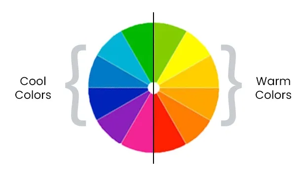
Warm color includes hues ranging from red to yellow-green in the color wheel. Warm colors are considered warm due to the fact they are the color scheme of daylight or the sunset.
Cool colors on the other hand are associated with night, cloudy or overcast days. Cool colors range from greenish-blue to blue-violet.
There have been many color theories revolving around color and human perception – which is how humans see and perceive color. Goethe’s theory stands out in which he stated that colors are subjective to people’s perception to it. Keeping that theory in mind we can confirm that warm colors such as, red and yellow are much more “active” than cool colors which would be more “soothing” in comparison.
Hue, Shades, Tints and Tones
Hues are colors we see in the color wheel in their natural state such as red, green, and blue-violet. However, shades, tints and tones are variations of these colors. More specifically:
- Shades – Black added to give darker variations of the hue
- Tints – White added to give brighter variations of the hue.
- Tones – Grey added to decrease saturation to make the color less intense.
Artists and painters had been varying their colors for years by mixing black or white into their paints to make more colors. This gave them the ability to increase their color palette and experiment with different color schemes.
Color Schemes
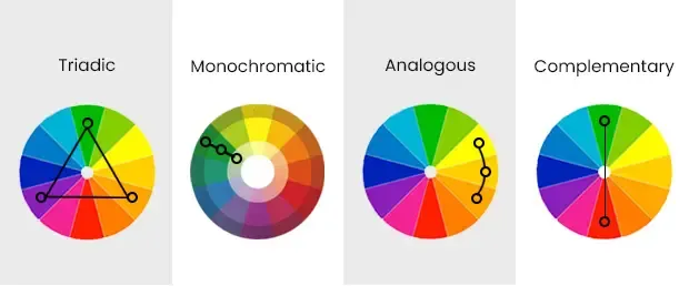
Color schemes are a chosen combination of colors used for art and design. With the aid of a color wheel, designers and artists can create a color scheme that would go well for their design or art piece.
There are different kinds of color schemes but the objective is same – pick a color scheme that is best suited for your project. You would be aiming for visual appeal, so choosing a color scheme that is pleasing to the eye or in harmony is also crucial.
Complementary Colors
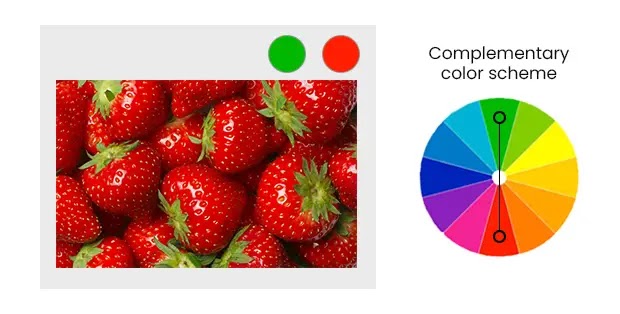
Complementary colors are the opposite colors of the color wheel. For example, orange and blue. A Complementary color scheme is great for achieving high contrast. Since both the colors are opposite of each other they don’t mix.
Complementary colors are great for logo designs or text (such as black on white). Be sure to keep the context in mind. If you are designing or painting an image just for decoration you might not need high contrasting colors.
Analogous Colors
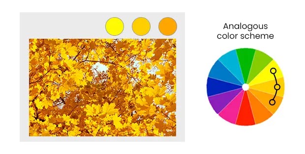
Analogous colors are colors similar to one other. On the color wheel these are colors that are close to each other. For example, yellow, chartreuse (yellow-green), and green. In graphic designing, analogous colors are used to create a color palette with a primary, secondary, and accent color.
Triadic Colors
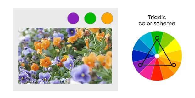
Triadic colors have equal space in between them on the color wheel. A triadic color scheme is extracted by drawing a triangle from the middle of the color wheel and choosing the colors on each point. Triadic colors are known to be vibrant and colorful so it is important to balance these colors for harmony.
A good way to balance these colors is to treat one color as your main and the other two as your secondary colors.
Monochromatic Colors
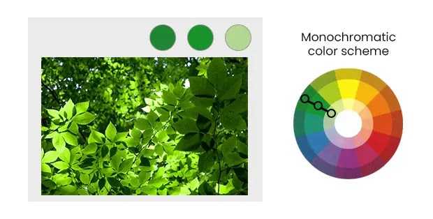
A Monochromatic color scheme uses only one color with different shades and tones. By using a color wheel we can extract different hues of a color. Then we can use all these different hues together to create our palette.
Monochromatic colors are one of the most common ways to achieve color harmony. As all the colors are closely related together it is easy to create a harmonious flow between them.
Color Harmony
Color harmony is when colors are placed together in such a way that they are aesthetically pleasing. A harmonious color scheme contributes to a good user experience (UX) because they are easier on the eyes. When something is visually balanced it is more attractive to the viewers whereas if colors are not in harmony – not properly balanced – they tend to catch the viewer off-guard. When someone doesn’t feel good when looking at your art or design they would refuse to look further.
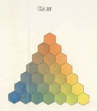
Although most designers and artists try to achieve color harmony some choose to go against the grain. As opposed to color harmony some use clashing colors as they stand out due to them not mixing well. These are great for attention-grabbing designs such as posters and advertisements.
When it comes to achieving color harmony there’s no one-size-fits-all. Many theorists have argued that there are ways to achieve color harmony through mathematics and science. However, many factors go into color harmony such as, age, gender, location, culture etc.
Designers and artists use color harmony to achieve a certain mood or aesthetic. Many ancient Greek philosophers and theorists have associated specific meanings and emotions to colors – called color symbolism. However, the main flaw with color symbolism is that these tend to be different for people.
So, when looking at the color wheel to find your harmonious color scheme, be sure to take the context and your audience in mind. Speaking of context this brings us to our next point, context of colors.
To learn more about Color Symbolism check out my Complete Guide on Color Meaning and Symbolism.
Context of Colors and Practical Uses of Color Theory
The context in which you use colors is important to achieving your goal – which might not always be harmony. If you are designing for readability you might need contrasting colors for your text such as, black and white. If you are designing a background for an event you might have to use harmonious colors that mix well together.
To use colors correctly you need to consider the context. Contextual use of colors is identified by looking at your goals – what are you trying to achieve with these colors? Basically, use your colors mindfully, if you are ever asked why you used a certain color, you should always be able to back it up.
Using colors in context refers to looking at things such as, what audience are you targeting? What is the audience’s culture like? What kind of a mood are you going for? Knowing the answers to these questions would help you use colors more deliberately.
The context is important for communicating your message properly. Using color correctly would allow you to have the right tone for your message and attract the viewer’s attention. This will not only make your designs stand out but would also make them aesthetically pleasing.
For example, consider the color red. The color red is seen as a sign of good luck in some countries like China. But that same red color is used to indicate lust and romance as well as to signal danger.
Take the color black as well. It is seen as a color to symbolize evil, death and darkness but at the same time it is considered a color of luxury. According to Hubspot, only 1% of people would consider a black product as cheap.
This is why the context matters so much. If you were designing an ad for high-end cars you might be hesitant to use the color black. Because the color black suggests evil and darkness – which is not the mood you are trying to create. But when put in the right context, black is seen as a color of elegance and luxury. This will have a better impact on the audience and will create a more appropriate vibe.
Another way of considering context in your designs would be to know how and where your design will be used. Let’s say you are making a poster for wild-life endangerment. You want your poster to raise awareness of the killing of innocent animals and people to appreciate the beauty of nature. Now consider the context.
You want to go for a calming vibe – to suggest the calmness of nature – and make your design beautiful to showcase the beauty of the jungle. At the same time you need to add a sense of urgency, making people realize that innocent creatures are being killed. How do you achieve all of this with color theory?
Firstly, you would choose your main color on the color wheel. This has to be in context with nature so we’ll choose blue to indicate the sky and because it is a cool color – that usually have a soothing vibe to them.

Now we have to make our color scheme that achieves color harmony because we need our design to be aesthetically pleasing and have a sense of balance. In this case, I’ll be using the analogous color scheme. Analogous colors are colors that are close to each other on the color wheel – this means our color scheme would include blue, green, and green-yellow.

Finally, we have to include a sense of urgency as well. This is a signal of danger, so red would fit well. Red also clashes with blue which means it would stand out. Since this is our main message, to stop killing animals, it needs to stand out.


Here’s another example. Let’s assume you’re designing a billboard for a local fast food joint on the roadside. Considering the context, many people would be in cars and motorcycles making it easy to miss your billboard. What colors can be used in order to make the billboard striking to passersby?
In this context, you might not want to use colors that are in harmony with the atmosphere. Colors like brown, green, and blue might mix with the landscape. But, colors such as, black, white, and yellow might stand out.
Understanding your environment like this can really give you an idea of how people would percieve your colors. This will help in making smarter decisions when thinking of choosing a certain color before designing.
Conclusion
By the end of this article you should have a good understanding of color theory. Color theory is a set of fundamental rules to use colors for visual appeal and communication. Color theory has an extensive history where many scientists, mathematicians, and philosophers devised different theories and ideas for color use.
In modern days, we have settled on the traditional color wheel using it to create color schemes that complement each other or are in harmony. Color theory is important for designers to know how and when to use the right colors. However, it’s important to note that color theory might be understood differently by each individual.
Although color theory provides a good guideline on which colors to use and how some might choose to use their own intuition. At the end of the day, color theory is pretty useful and can definitely give you a better idea of how to use color for better designs.


